Network map
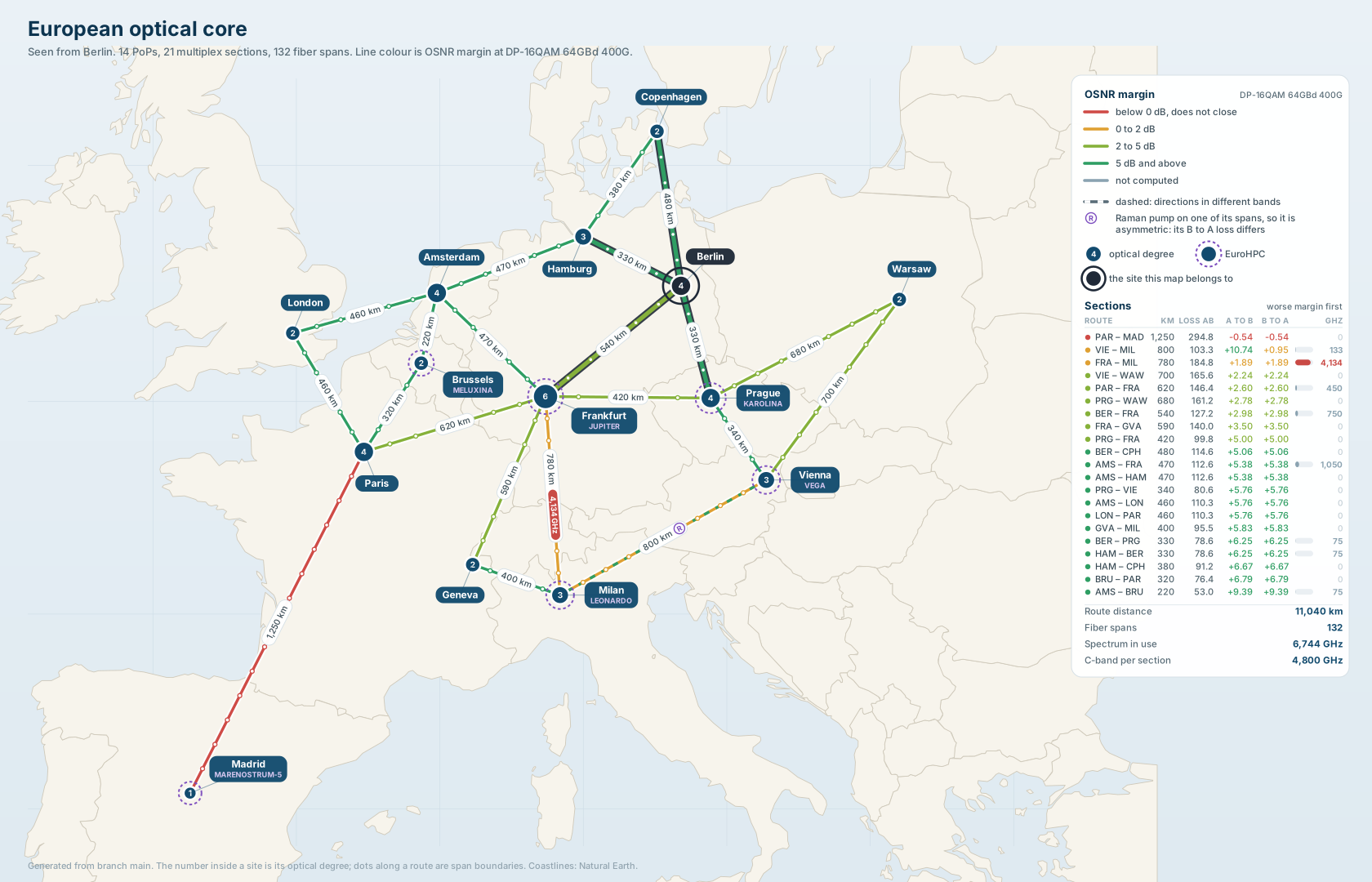
Berlin's copy. Every figure on it is read from the branch, so nothing here is typed in. Click it to open the SVG at full size, where the panel type is legible.
Every PoP carries a drawing of the whole optical core. Open a site in Infrahub,
then open its Artifacts tab. network-map is an SVG of the fourteen PoPs,
the 21 multiplex sections between them and the 132 fiber spans inside those
sections. Each route is coloured by the OSNR margin a fixed reference mode,
DP-16QAM 64GBd 400G, would have on it. That is a margin evaluated on every
section alike, not the margin of whatever wavelength happens to be lit there.
The map is produced by the same code the checks and the reports call. Nothing on it is drawn by hand, and no figure on it is typed in.
Where to find it
OTN Sites in the sidebar, then any PoP, then Artifacts. Infrahub renders the artifact from this repository, so the maps appear wherever the repository is registered, and a later pipeline run against a change re-renders them. An unchanged network renders byte for byte the same file, so a map that did change is a network that did.
One map is rendered per PoP. Each copy draws the same network and emphasises a different site. The site the copy belongs to gets a dark ring, and the routes terminating on it are drawn heavier than the rest. A copy therefore reads as that site's reach into the core rather than as a general map with a pin stuck in it.
Amsterdam Science Park carries no map. It is a customer campus on the end of a coarse metro tail, it belongs to no multiplex section, and the map does not draw it. A map attached to it would be a picture of a network it is not part of, so the absence is the correct result.
Why the colour is a margin and not a loss
Route colour is the OSNR margin for DP-16QAM 64GBd 400G, which needs
24.500 dB, and the check adds 1.000 dB of system margin on top, so a section
has to deliver 25.500 dB to pass. The mode is named on the map, next to the legend, because a margin
means nothing without the mode it is a margin against.
Loss was the obvious first choice and it is the wrong one. The plant here is uniform, so a section's loss tracks its length almost exactly, and a map coloured by loss draws how long each route is. The distance labels already say that. A margin answers the question a planner actually asks: does a carrier fit on this route, and by how much.
| Colour | Margin | Sections on the shipped dataset |
|---|---|---|
| Red | below 0 dB, does not close | 1 |
| Amber | 0 to 2 dB | 2 |
| Olive | 2 to 5 dB | 6 |
| Green | 5 dB and above | 12 |
| Grey | not computed | 0 |
A section is budgeted once from each ROADM, and the two amplifier chains do not have to agree, so a route is painted with the worse of its two directions. Both figures are in the panel table.
Grey is a fifth answer and not a missing one. A section whose margin could not be computed keeps its route and loses its colour, because an absent number is a different statement from a good one. Dropping the route would make the network look better connected than it is, and defaulting it into a passing band would make a broken section look healthy.
Paris to Madrid is the red one
DP-16QAM 64GBd 400G does not close on Paris to Madrid. The margin is
-0.535 dB, in both directions, and that is the section the red line is.
The route is 1250 km, the longest single section in the network, and there is no intermediate PoP to split it into two shorter ones. Half a decibel is what a section that long costs at that modulation. This is why the OSNR check fails on the default branch, and it is a true finding about a long route rather than a fault in the data.
The colour is a verdict about one mode, not about the fiber. Drop to
DP-QPSK 32GBd 100G and the same section holds +9.965 dB, which is the tightest
margin anywhere in the network at that mode. The
link budget page has the three answers an engineer would
reach for, and what each one costs.
The one asymmetric route
Vienna to Milan is the Raman-pumped section and the only route whose two directions land in different colour bands: +10.743 dB in the direction the pump serves, +0.955 dB against it.
A pump credits its on-off gain to the one direction it amplifies, and its combiner charges insertion loss to both. The map marks the route with a dashed overlay in the better direction's colour and puts a circled R on it. A route that is good one way and thin the other is not read as uniformly thin.
What each visual channel encodes
| Channel | What it says |
|---|---|
| Route colour | The worse of the section's two OSNR margins at the reference mode |
| Dashed overlay on a route | The two directions sit in different bands. The dashes are the better direction's colour |
| Circled R | A Raman pump on one of the section's spans, which is what makes it asymmetric |
| Dots along a route | Span boundaries, one per amplifier site, placed at the fraction of route length where the hut sits |
| Node radius and the number inside it | The site's optical degree, the number of sections terminating on it |
| Dashed violet ring and a second caption | The site hosts a EuroHPC machine, named in the caption |
| Dark ring and heavier route casing | The site this copy of the map belongs to |
| Label riding a route | Route length in kilometres, rotated to follow its own line |
| Chip on a route | Spectrum in use in gigahertz, shown only on a section holding a quarter of the C-band or more |
Frankfurt to Milan is the only section wearing a chip: 4,134 GHz of the 4,800
GHz the C-band gives it. The denominator is on the panel's totals line rather
than in the chip, because the chip rides a rotated route and the box is narrow.
Below a quarter of the band the figure is in the panel table and nowhere else,
because a chip on all 21 routes would be 21 boxes competing with the distance
labels.
The map stays sparse on purpose. Exact figures live in the panel on the right, which holds the legend, then every section as a row, ordered worst margin first, with length, loss, both directional margins and occupancy. Under the table are four totals: route distance, fiber spans, spectrum in use, and the C-band extent per section. The footer names the branch the map was generated from, since a margin and an occupancy figure are true of the branch they were read from and of nothing else.
A network with no services yet
On a branch holding the plant and no carriers, the occupancy column reads zero on every row, no route wears a chip, and the spectrum in use total reads 0 GHz. That is the correct picture, not a broken render.
Occupancy is derived from the carriers on the branch rather than stored on the section, so it answers for that branch and moves the moment a service is provisioned. Provision one and the next render of the map shows the gigahertz move by exactly the width of the mode that was chosen.
Coastlines
The land, the borders and the graticule are Natural Earth 1:50m outlines, public domain, embedded in the repository as generated Python data. The renderer makes no network request and no mapping library is installed. The developer guide has the command that regenerates the data.